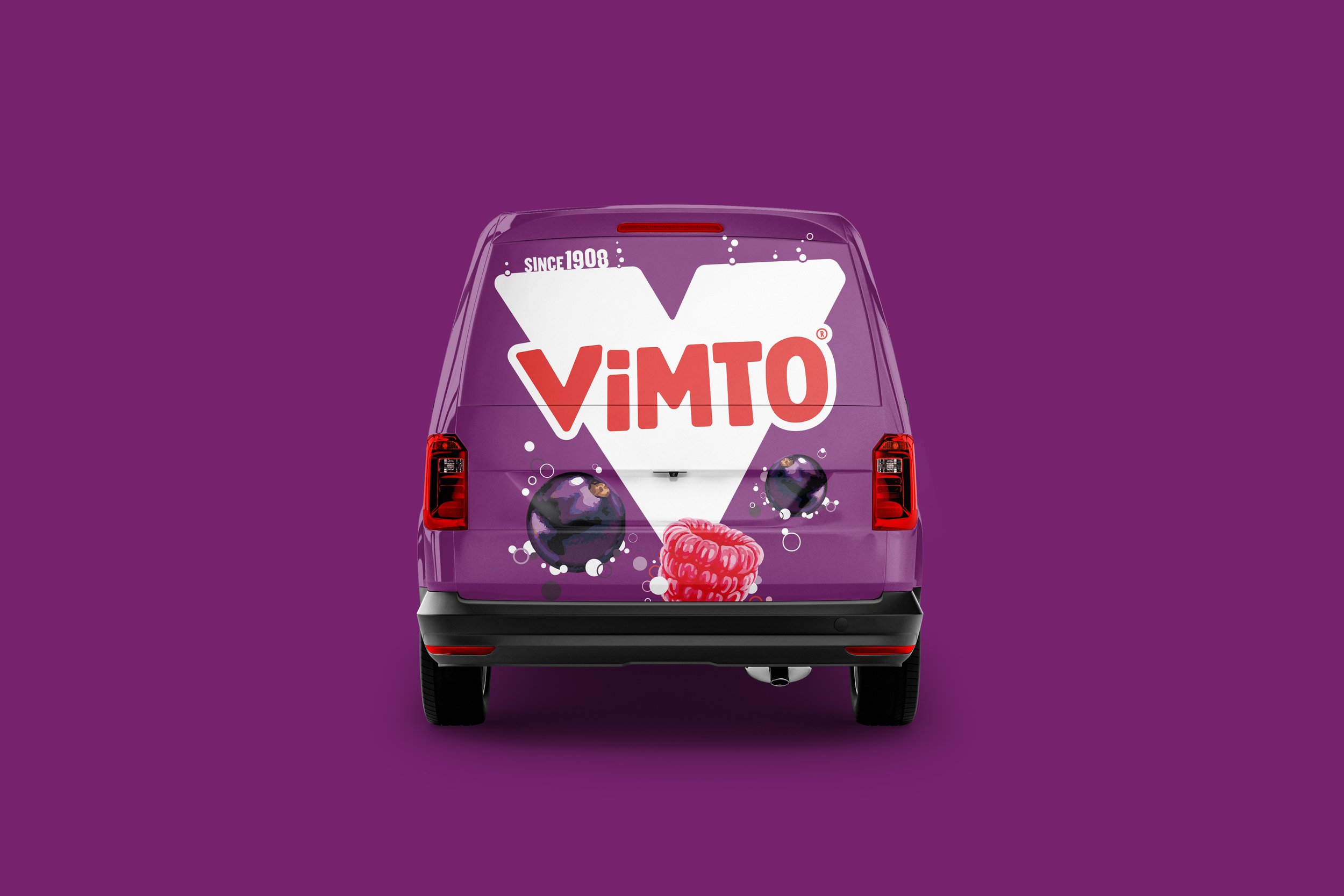
Vimto® International
The Vimto brand had become somewhat diluted and messy internationally, after a number of brand changes which had hit the various markets played in, at different times. Masterbrand consistency was badly needed.
Brief
Implement the Vimto rebrand internationally, to the various markets across Africa, the Middle East, Asia, Europe and the U.S.
Solution
The task was to develop design consistency across all markets, whilst factoring in various complexities unique to the international business.
Internationally, Vimto takes on two guises, known as ‘purple product’ (similar to what is known in the UK), and ‘red product’, with a more traditional look. Purple is newer to market, whereas red plays in markets where Vimto has been long established. Certain markets can be resistant to change and therefore trust ‘their’ product to be the genuine Vimto product. The rebrand needed to be conscious of this.
A suite of logos for use across the international portfolio was created, including versions in Arabic. There was a need for the ability to quickly and simply adapt the logo to different product formats and types (e.g. still and sparkling), across different flavours, all in various languages.


A key point to consider was that in certain markets, the juice content within each product, determined whether or not fruit could be depicted on pack and on advertising. In order to facilitate both scenarios, ‘with’ and ‘without’ fruit lockups were developed.


Concise templates and design rules were developed to cover a host of potential label formats, as well as outer packaging. Considerations here included repeated use of the logo on certain formats, to keep the brand front and centre. On back of pack, the potential use of multiple languages was factored in when creating layout systems.
A simple off pack design style was created, which centred around making the product the hero and having a clear message. Use of single or multiple products was considered, as well as the mixing of different products, inclusion of fruit/no fruit and pricing or other key information. The need to be sensitive to the variety of cultures, traditions and languages across the markets was at the core of this simple design structure, in order to make tailoring the designs to key events such as Ramadan, as simple as possible. The master design style needed to have the ability to flex to the specific needs of a particular market.
Since 2020, the rebrand has been steadily and methodically implemented across the various markets and has encouraged new ones to open up too.
©Nichols PLC


