No Flies
No Flies is an independent, residential property sales agency, based in East Dulwich, South East London. Operating solely online, they offer exactly the same services as high street agents. Their aim is ‘to become the agent of choice in the areas in which we operate, by delivering excellent customer service, for very competitive fees’.
Brief
This self initiated passion project began life in 2015, when as a younger and more inexperienced designer living in London, I was looking to create pieces of work for my portfolio. One of No Flies’ directors was my landlord at the time and I saw their business as a good opportunity to develop my skills.
Having developed a mark that I really liked at the time, it was never developed beyond this. Fast forward almost 10 years, I re-discovered the designs on an old hard drive and still liked what I came up with. I felt compelled to develop the concept into a new brand identity for the company and set myself the challenge of bringing it to life!


Solution
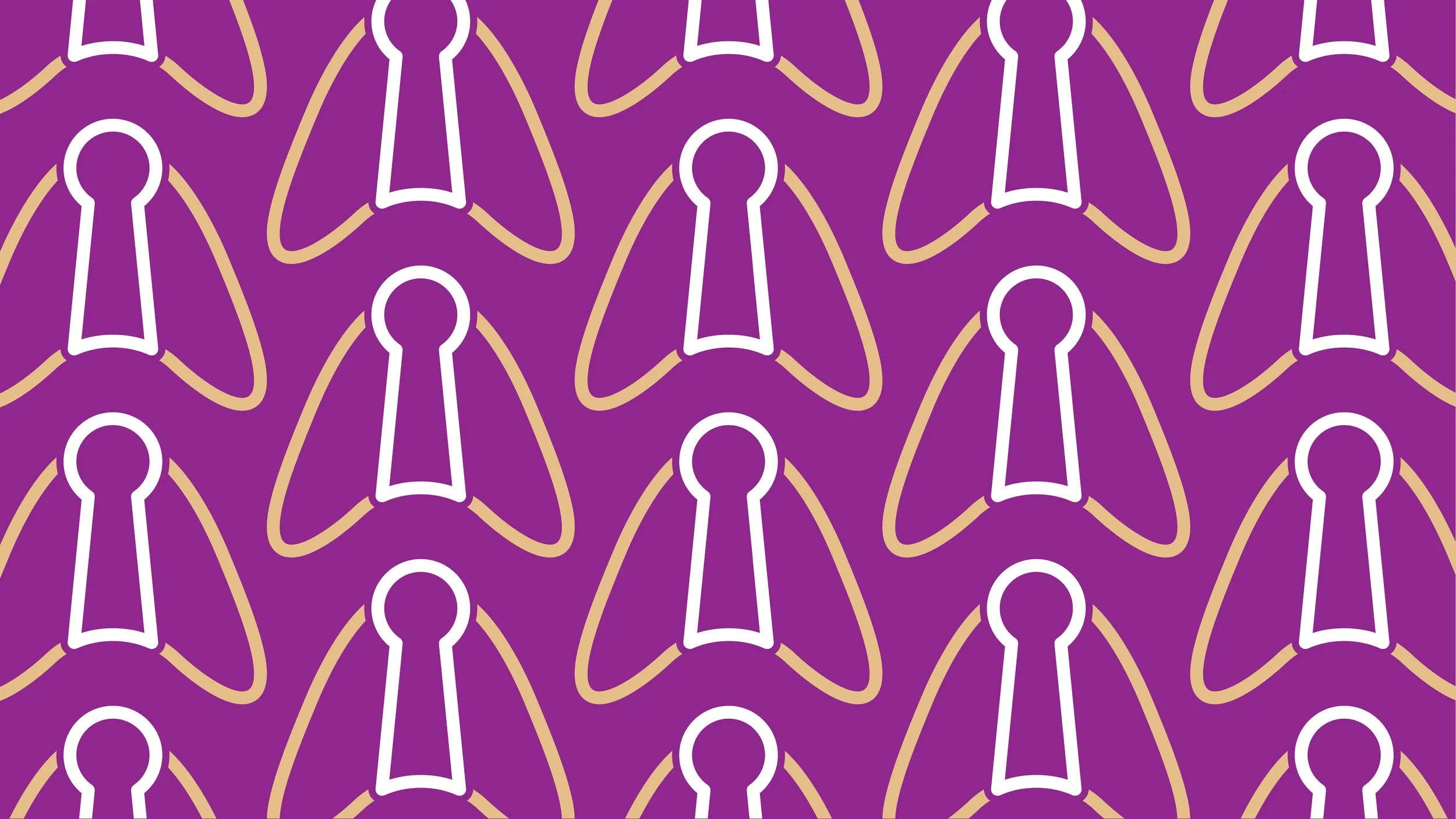
The logo centres around a mark or icon, which is a keyhole with wings. Not only does this obviously signify the No Flies element of the company name, it also brings an obvious nod to the industry in which they operate. The fact that it has wings could also signify the sense of hope that No Flies bring to those buying and selling their properties, and also the weight that they lift off them with the help they provide.
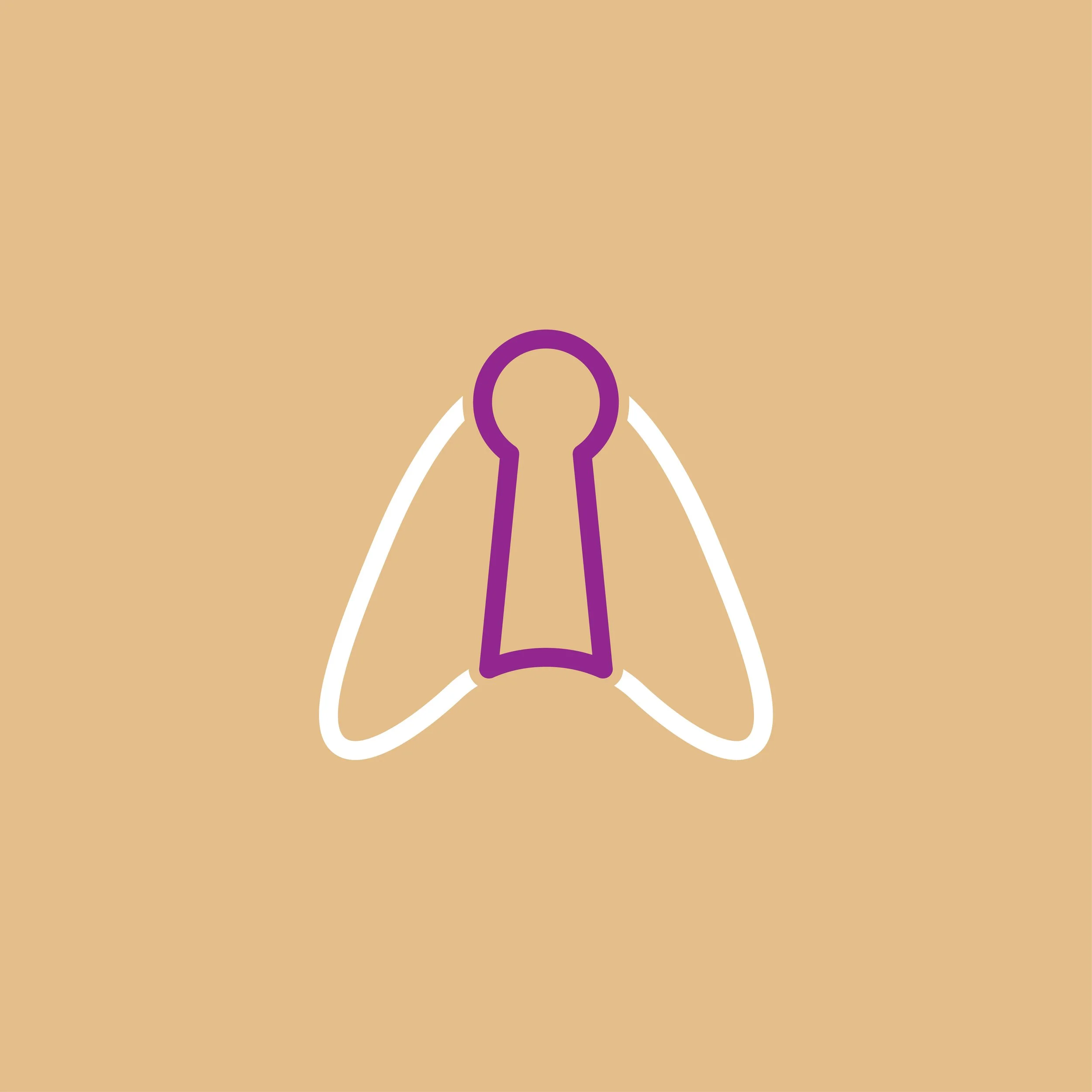

The logo has a feeling of quality and I wanted the colour palette to reflect this. Again, as a nod to the architectural features of the area, the ‘stock brick’ colour is inspired by the bricks commonly used in London and the South East. This colour is golden yellow in hue and has a feeling of warmth and approachability, whilst feeling luxurious.
To compliment this, and in some way inspired by the purple themed decor throughout tour rented flat, ‘Prosperity’ is a strong contrast to the lighter ‘stock brick’, which allows for strong cut through when the colours are used in combination. Purples are said to represent a great many things, including prosperity, ambition and luxury. Finally, these shades are at times, offset with white, which gives a powerful clean punch out of the colours.


Below are just a few examples of how the identity can be used and applied in different situations and formats. From use portrait, horizontal, or as a gorgeous pattern for more creative license, you can see it is an adaptable and flexible design that feels iconic and traditional, with a modern and approachable twist!


I always loved the concept behind the name of No Flies and I think the way ‘No Lies’ was brought out through the typography of the current logo was a clever touch. Credit to the designer on pulling that out and I wanted to respect that touch with the updated identity. However, I felt there was more that could be done with the ‘No Flies’ reference, whilst building in a visual nod to the property industry. I feel I have balanced the two well whilst paying respect to the original design below.