Sweeper Hire
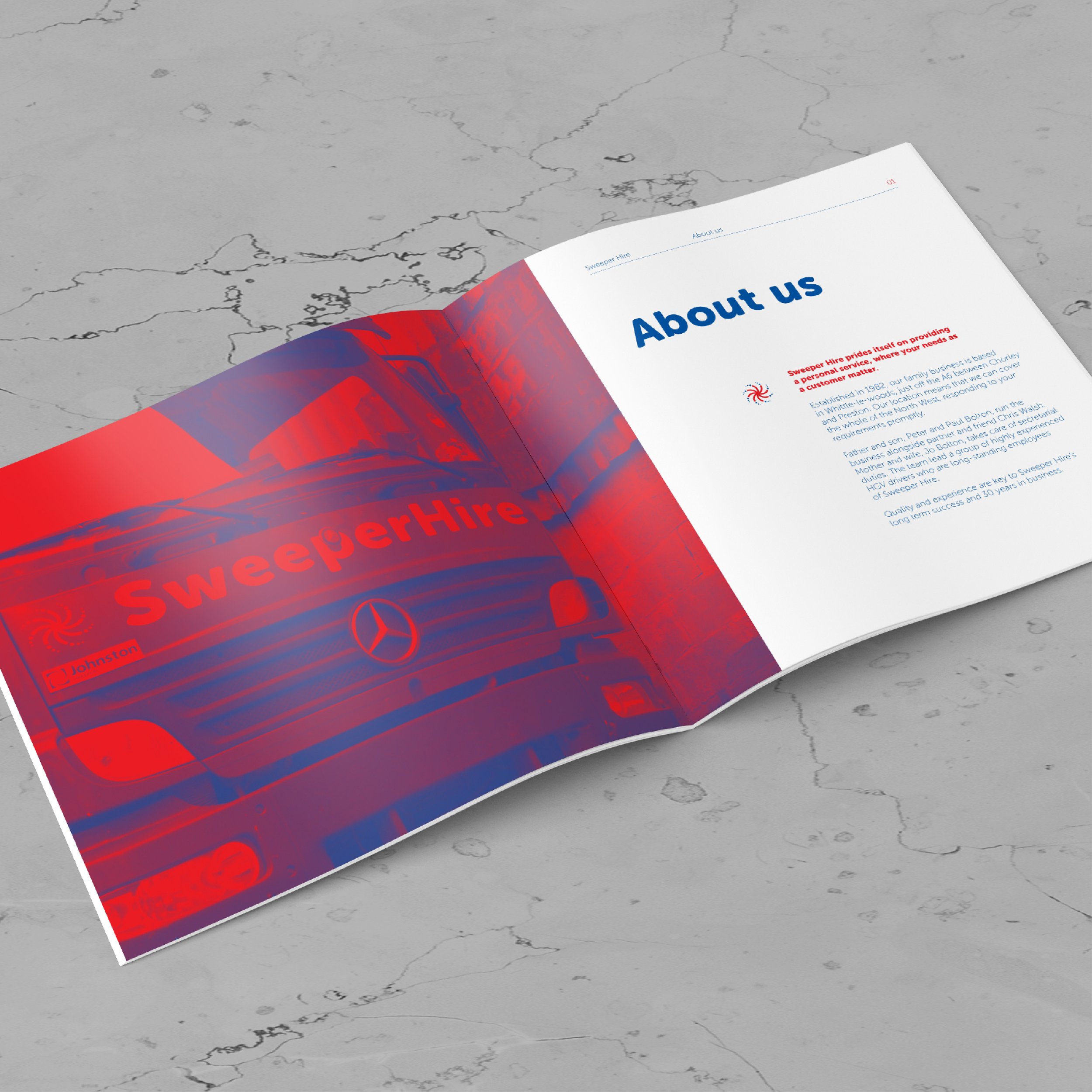
Sweeper Hire are a family run road sweeping, site clearance and HGV maintenance business, based in the North West of England. They pride themselves on providing a reliable and personal service, which they have done for over 30 years.
Brief
The brief was to develop a new brand identity for Sweeper Hire, which refreshed and modernised their tired, dated and inconsistent branding. In fact, their existing ‘identity’ was almost none existent, with only the blue and red colour palette giving any form of consistency to their identity. The truck signage saw a multitude of different typefaces in use, using a jarring yellow colour for the company name, which did little for the freshness and cut through of the brand.
Solution
A simple mark was drawn to resemble the sweeper brush head and it’s motion throughout cleaning. Paired with a clean, modern but friendly and approachable typeface, two logo variants were produced (stacked and horizontal) for use across different applications. This was particularly important for use across the wagon cab signage.

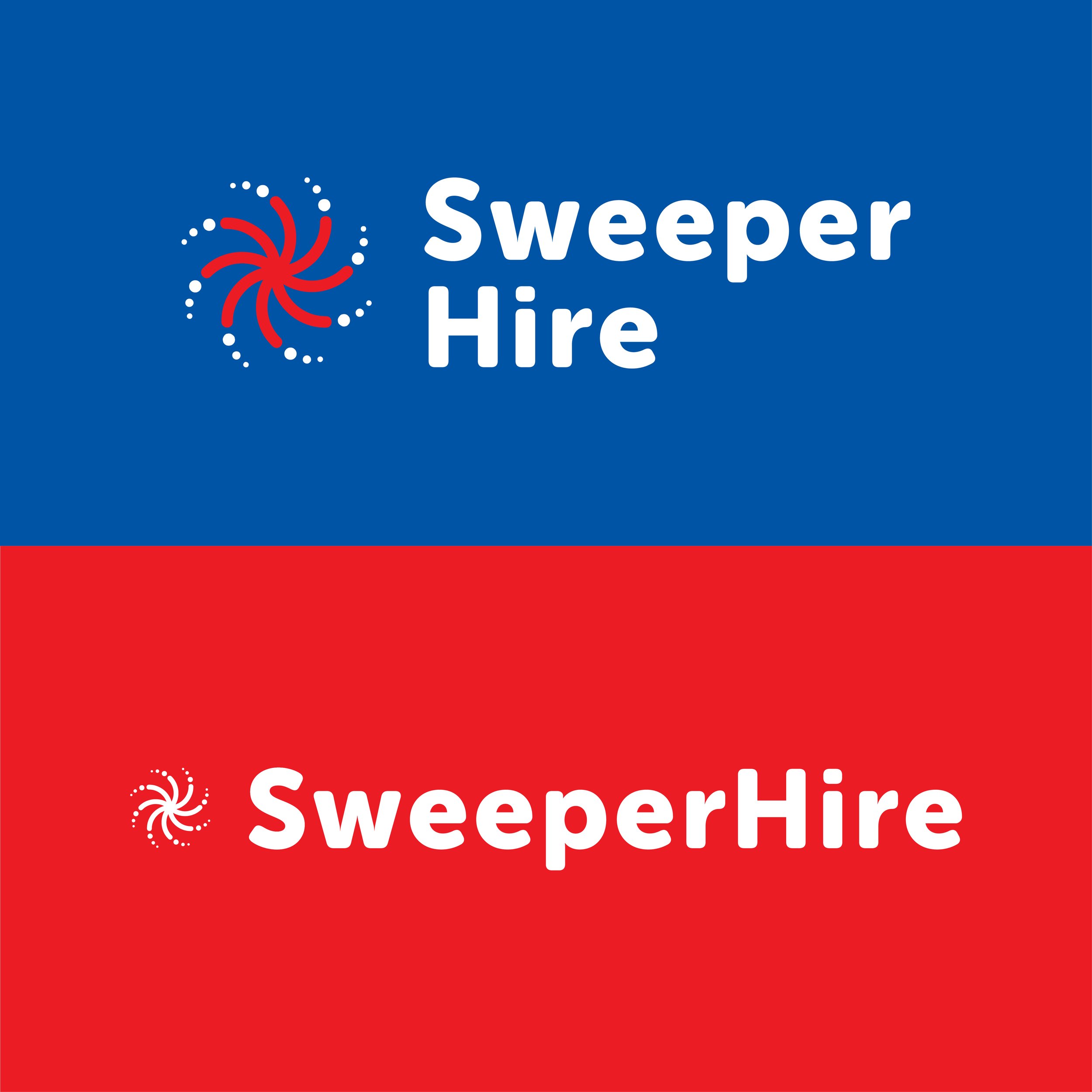
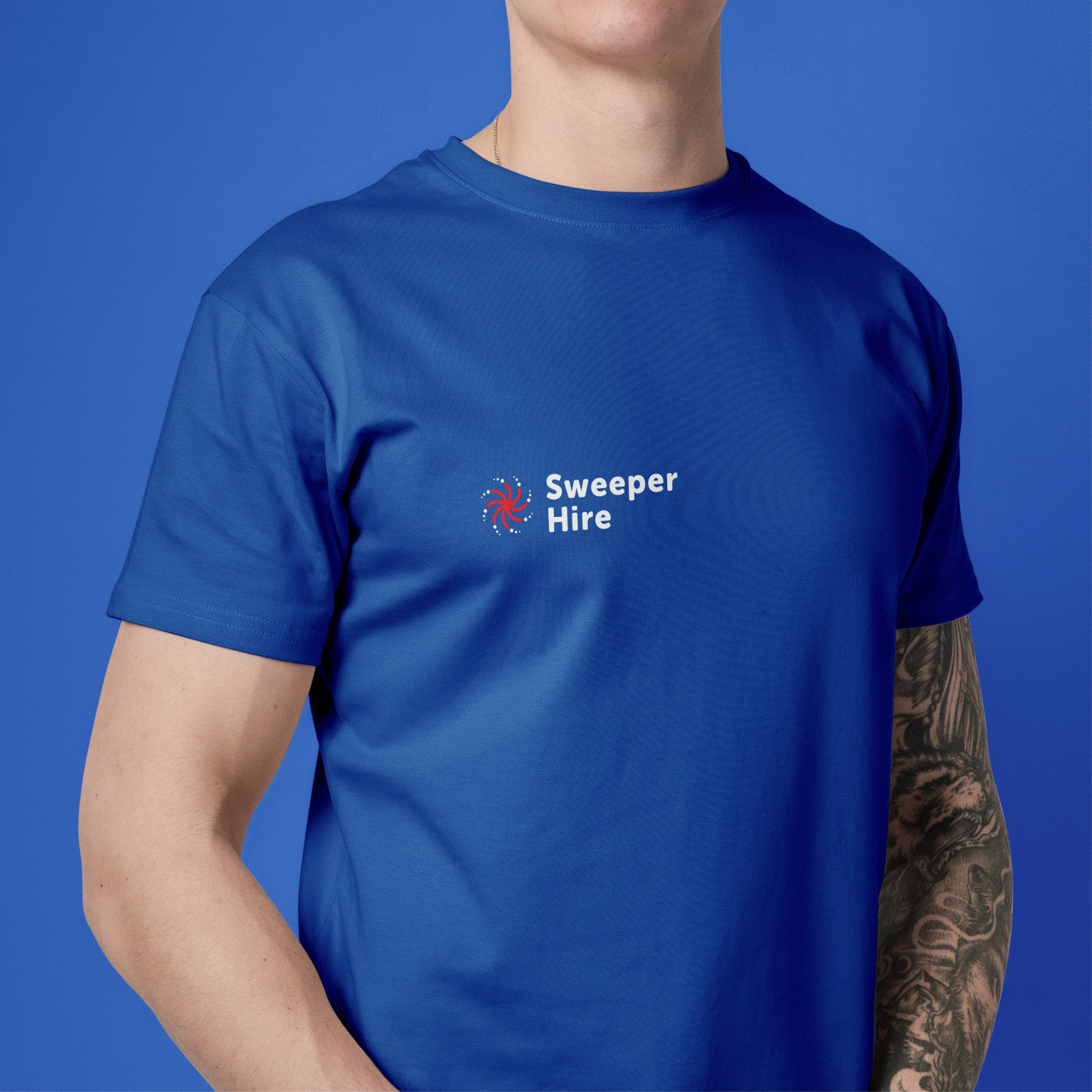
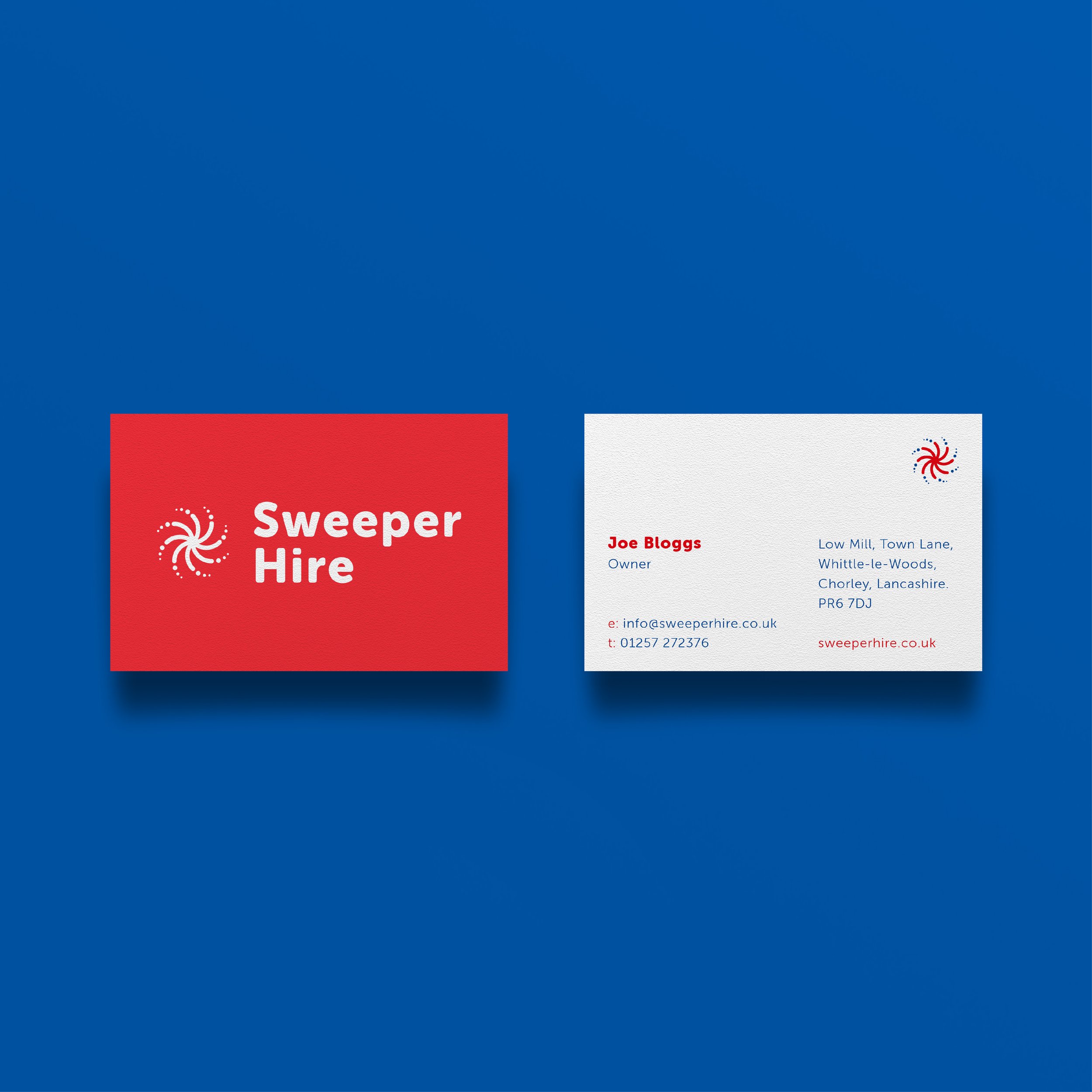
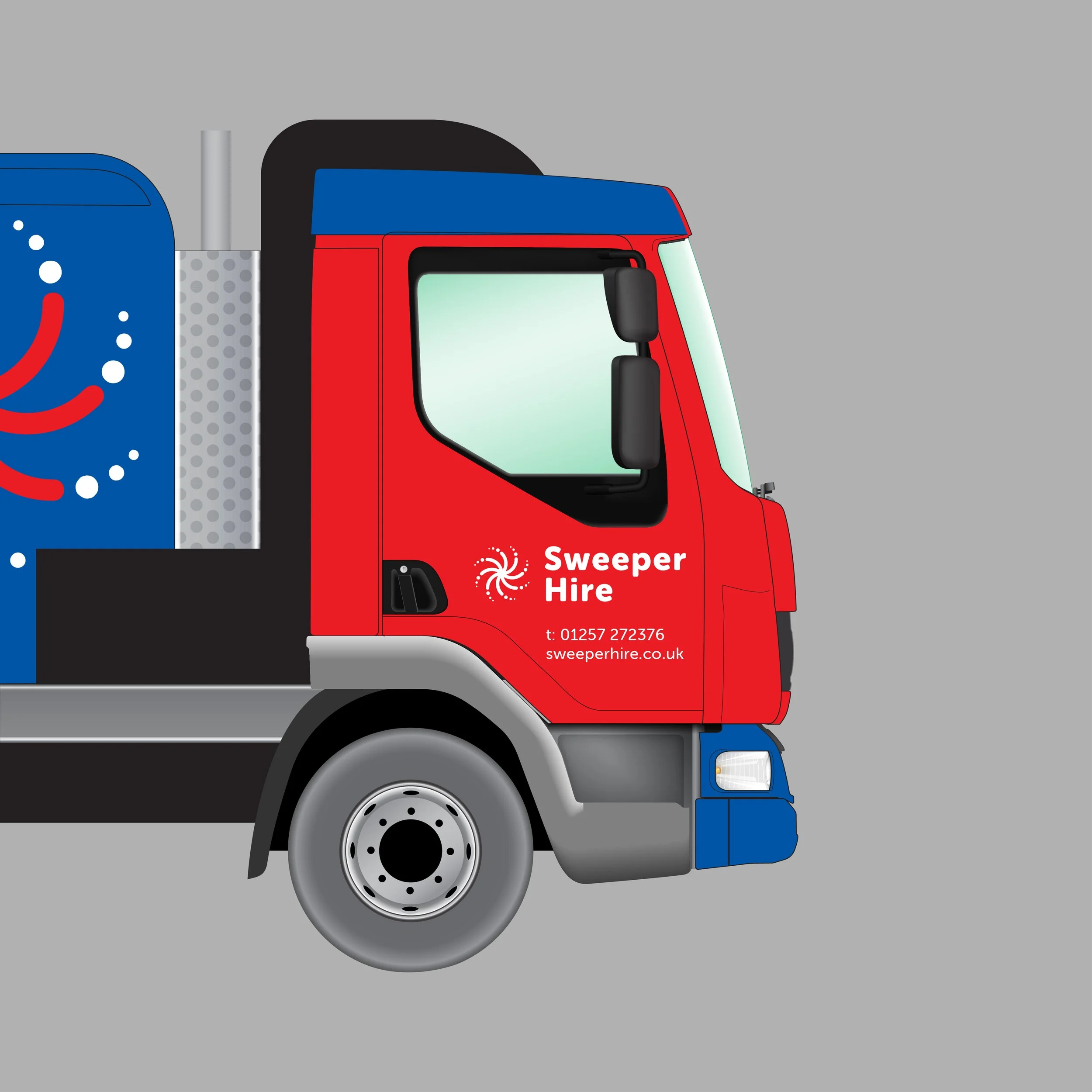
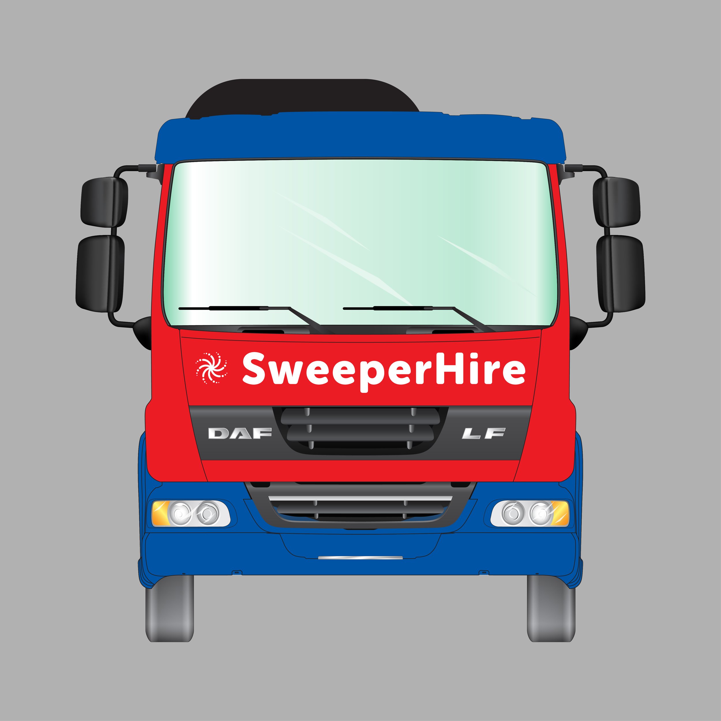
The colour palette was updated to feel much fresher, whilst still maintaining the recognisable 2 tone look the company had become known for. The identity was then taken across a range of stationery items, printed marketing materials and t-shirts, before being applied to their fleet of road sweeping and gully sucking trucks.
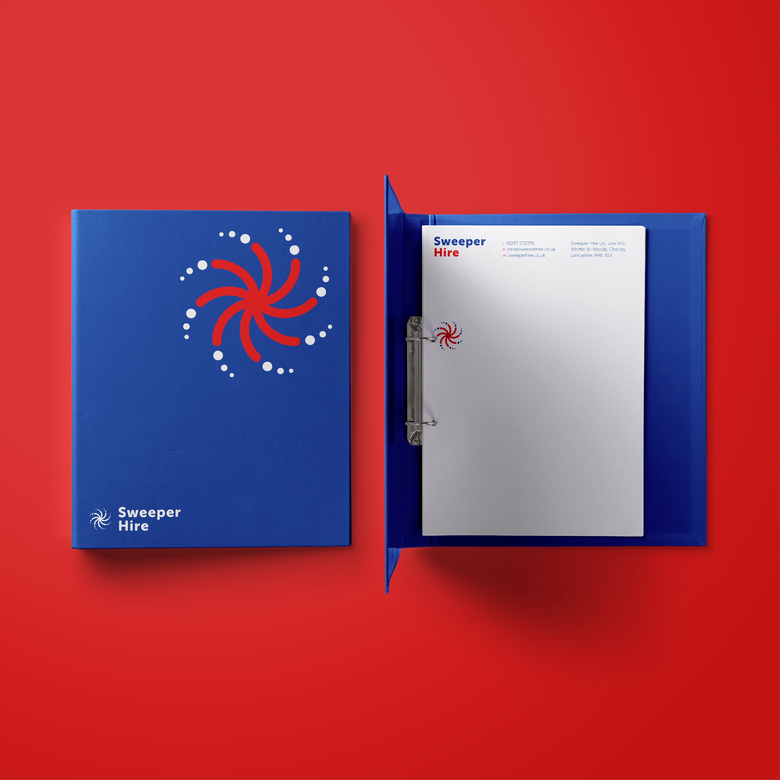
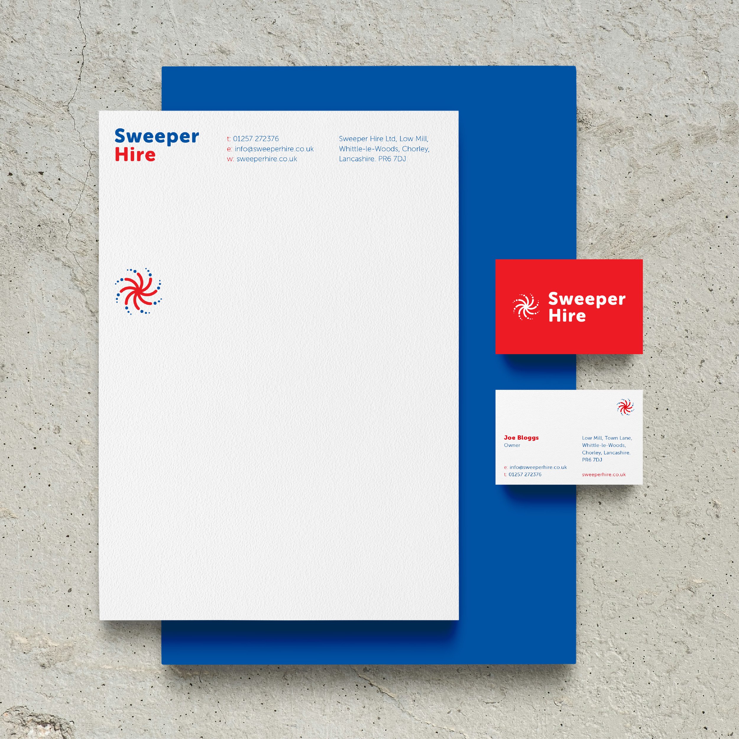
Although Sweeper Hire decided to proceed with a slightly different logo to the one shown here, I felt this design was a more considered solution and more practical in terms of application.
