Lost in the Backpack
Lost in the Backpack (LITB) is an adventure and travel blog, set up by partners Molly and John. Initially created to document a holiday of a lifetime to Malaysia and keep family members up to date on their travels, they decided to take the blog further after it turned out to be a hit!
Brief
The brief was to develop an identity for the blog, which represented wanderlust and the idea of ‘living out of a backpack’ whilst on travels and adventures.
Solution
Travel, exploration and adventure is steeped in history, with stories often romanticised in folklore and tales of old. The aim was to capture this history in the LITB identity, whilst marrying it with what travel looks like in the modern era.
These days, exploration has changed beyond all recognition, not least with the ability to travel further and faster by modern transportation, but also with the use of the internet for navigation, communication and itinerary planning.
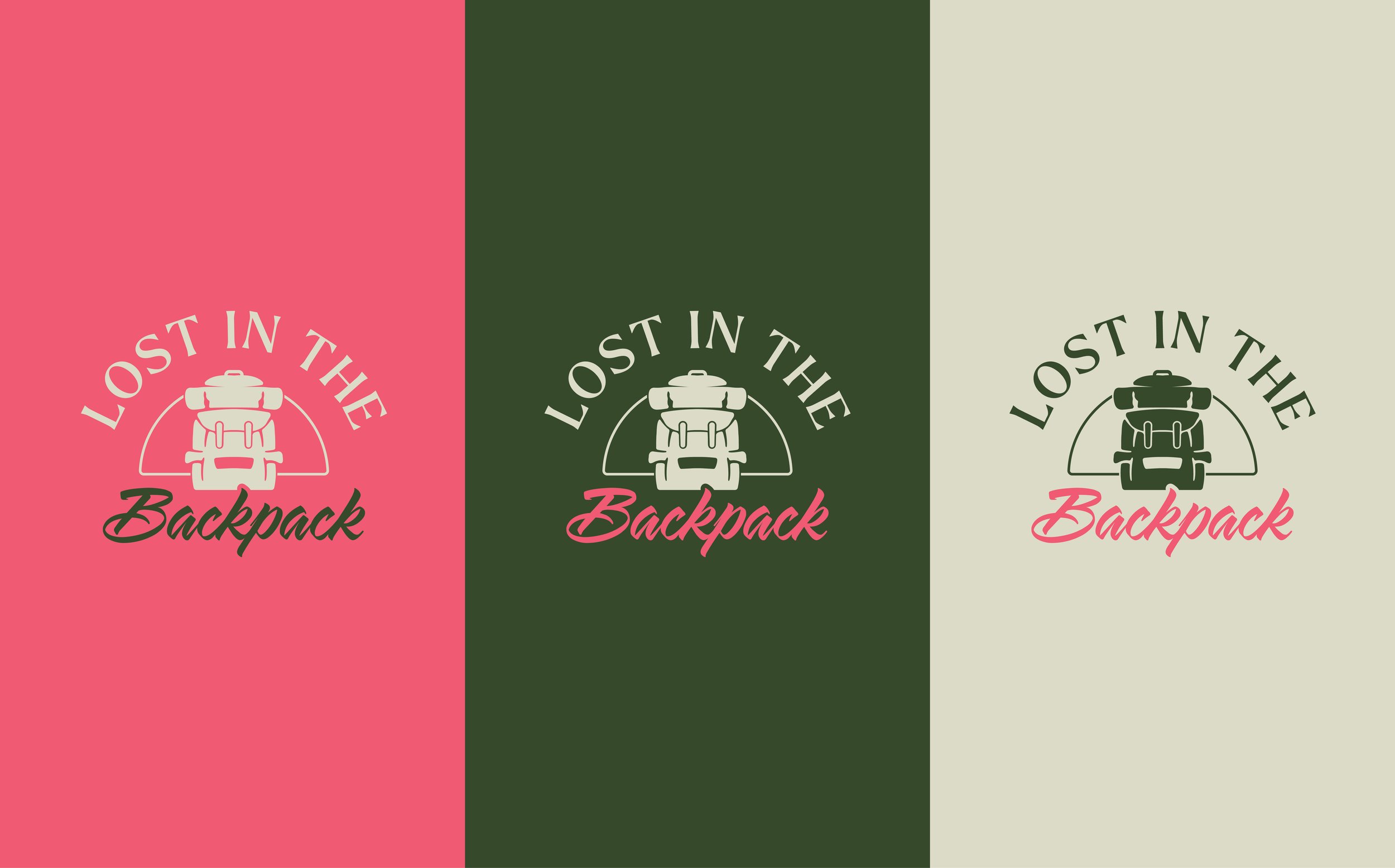
The logo centres around a backpack illustration, instantly signifying the nature of the blog’s content. A simple, retro illustration style was combined with traditional sans serif and handwritten typefaces to give that nod back to the old. This was then offset by the warm, bright and punchy colour palette to add the modern twist, a take on today’s travel habits and quirks.
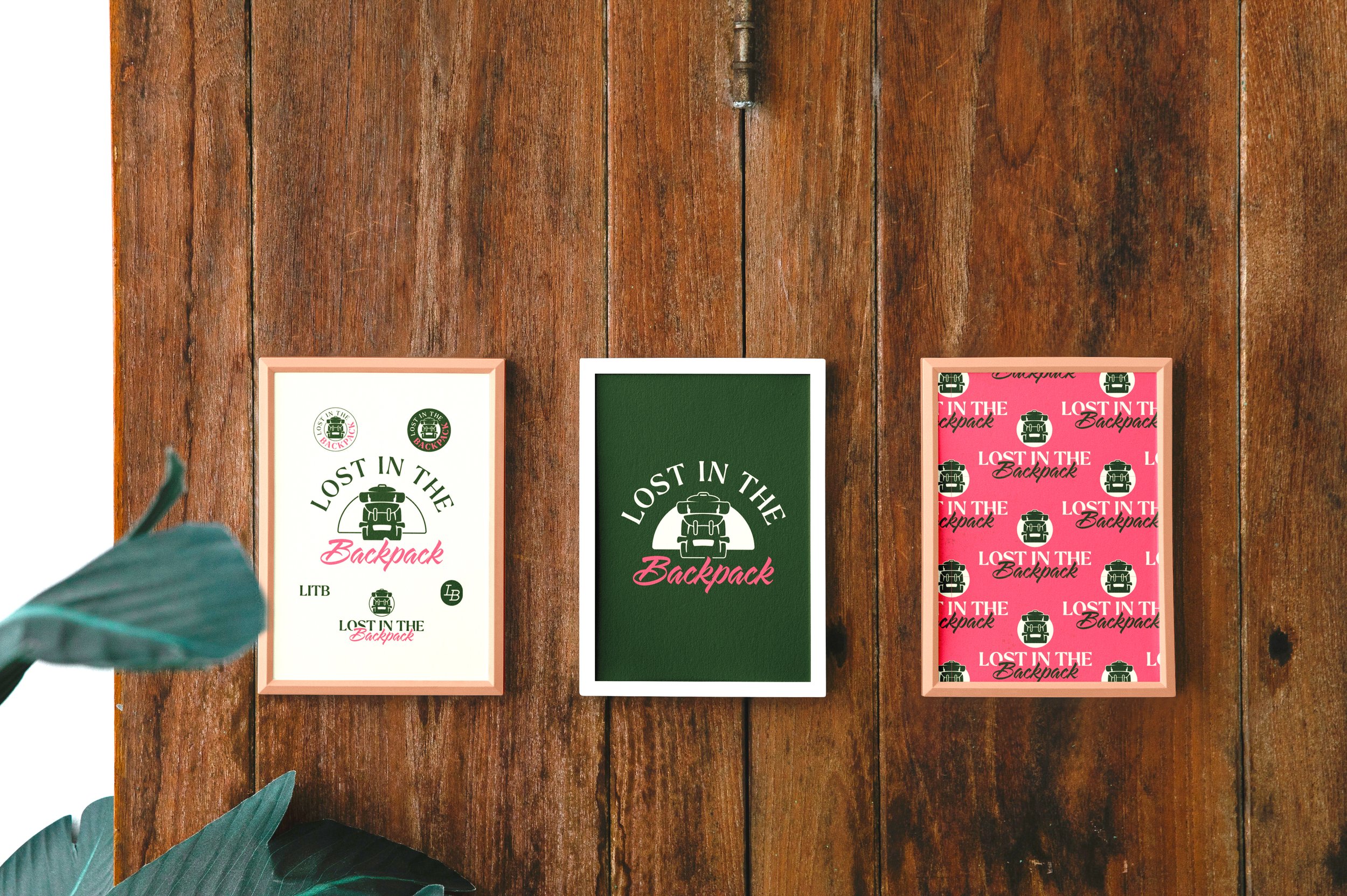
Some secondary logos and marks were developed around the same theme, to ensure the brand’s flexibility across different touch points. Below are some examples of how these marks were applied in different scenarios.
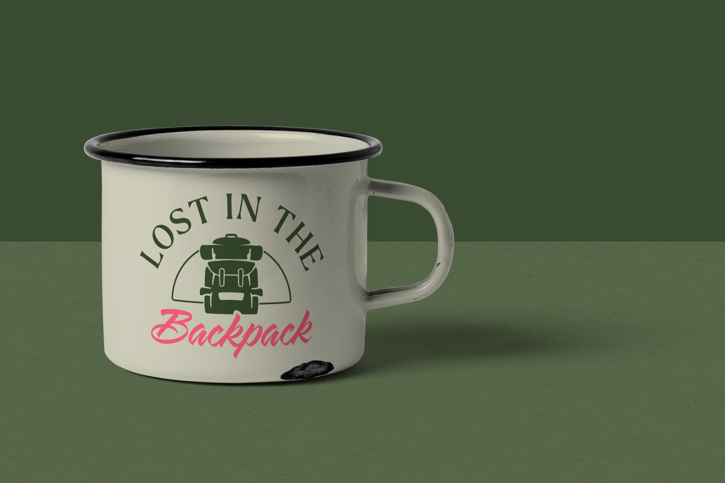
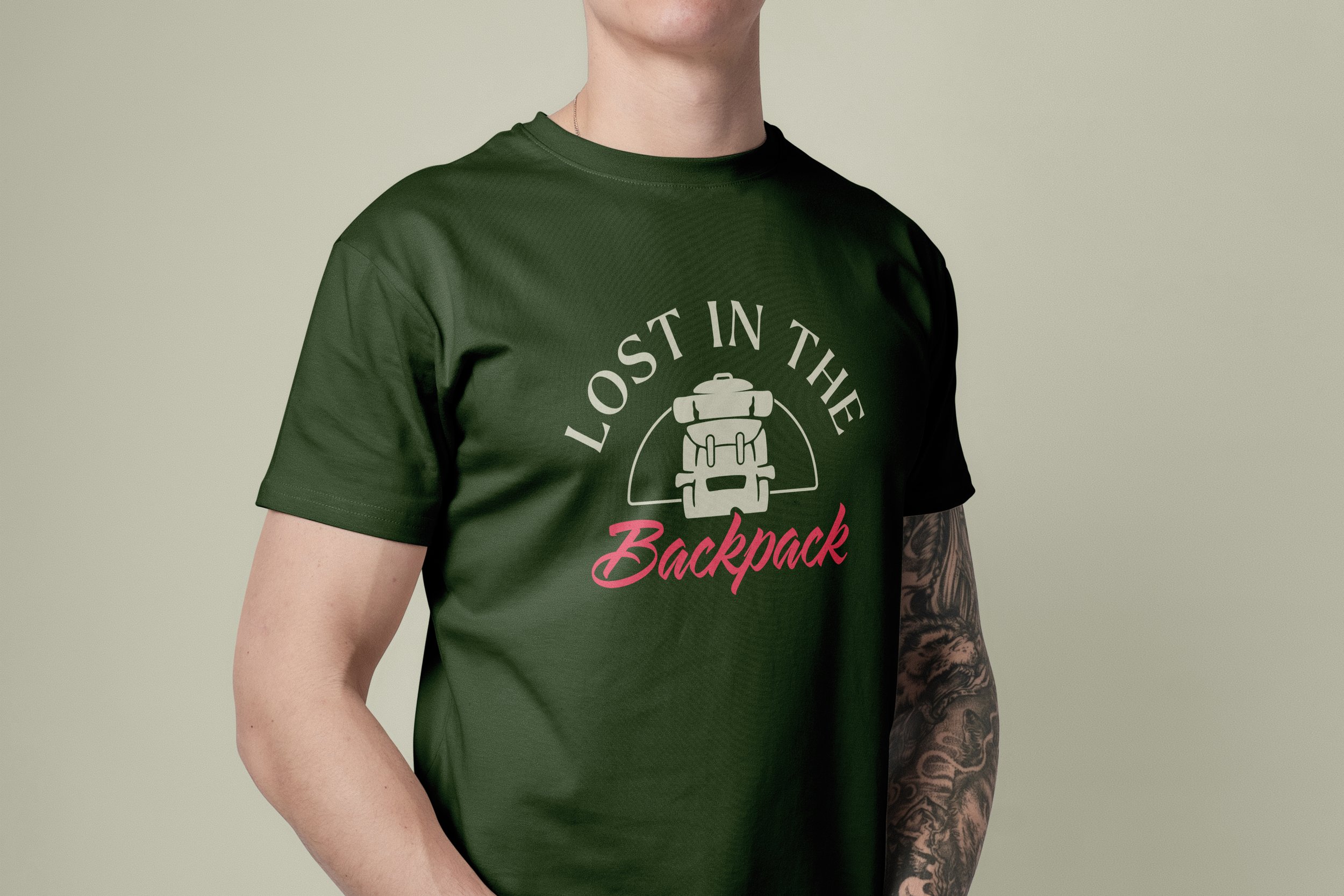
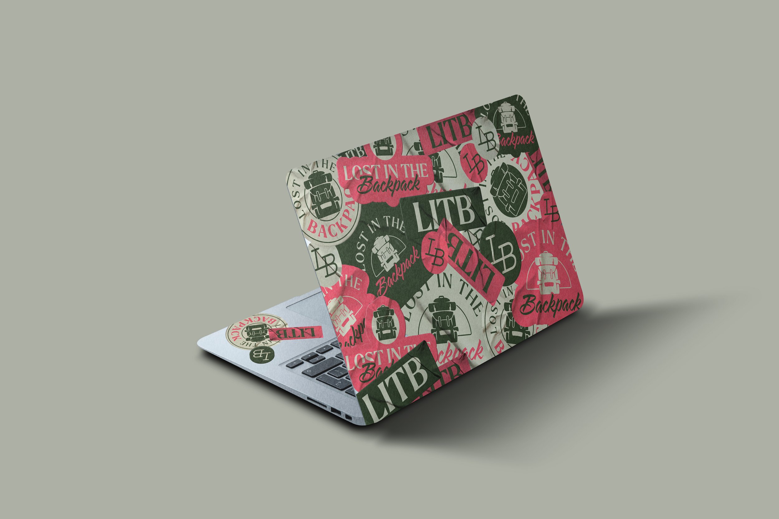
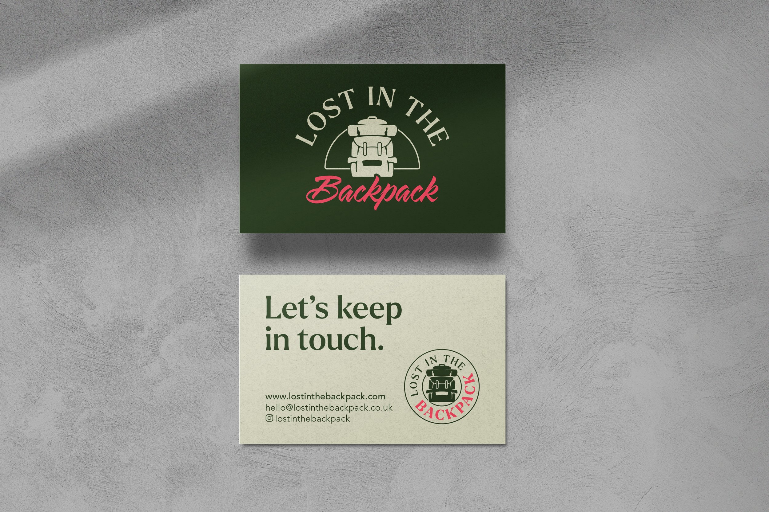
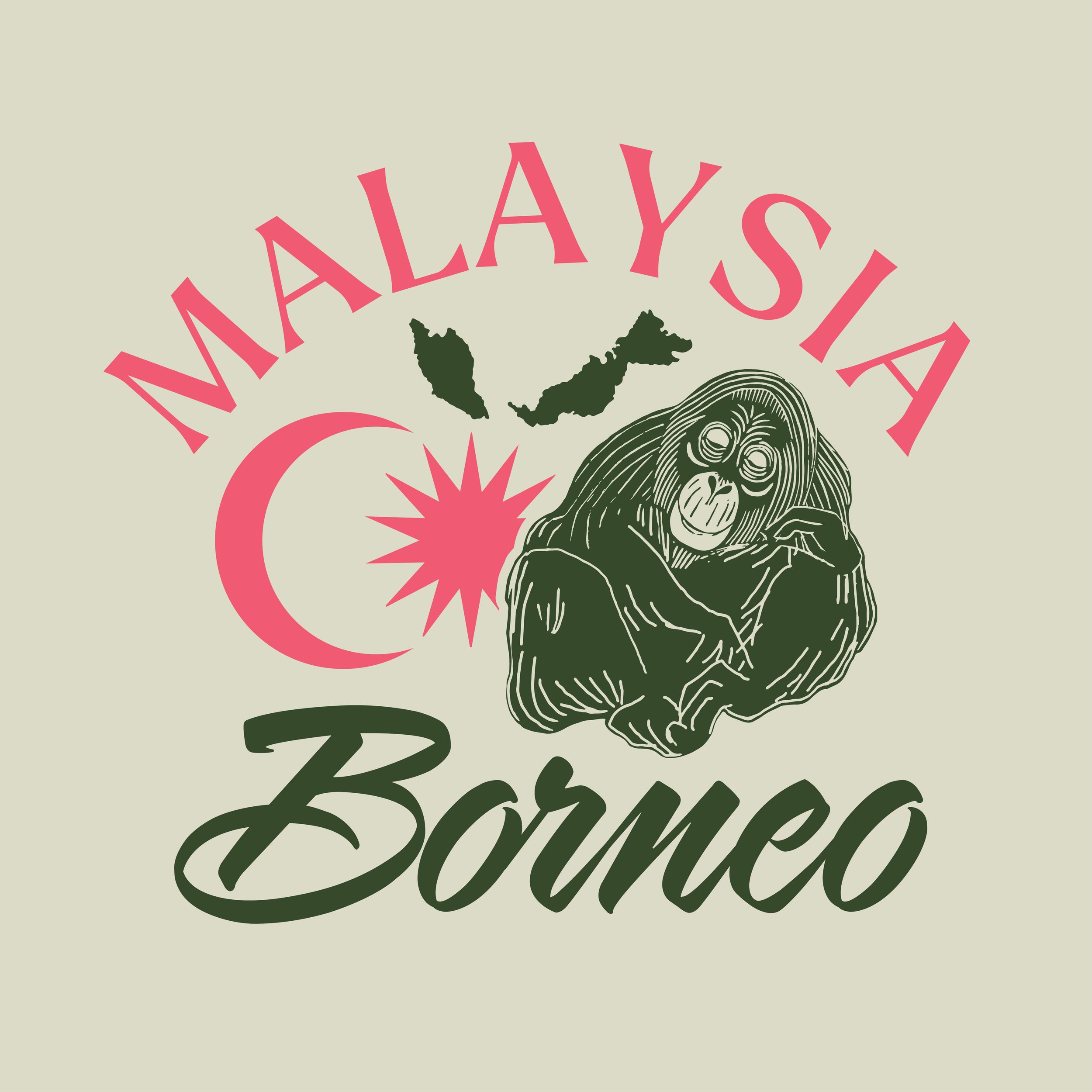
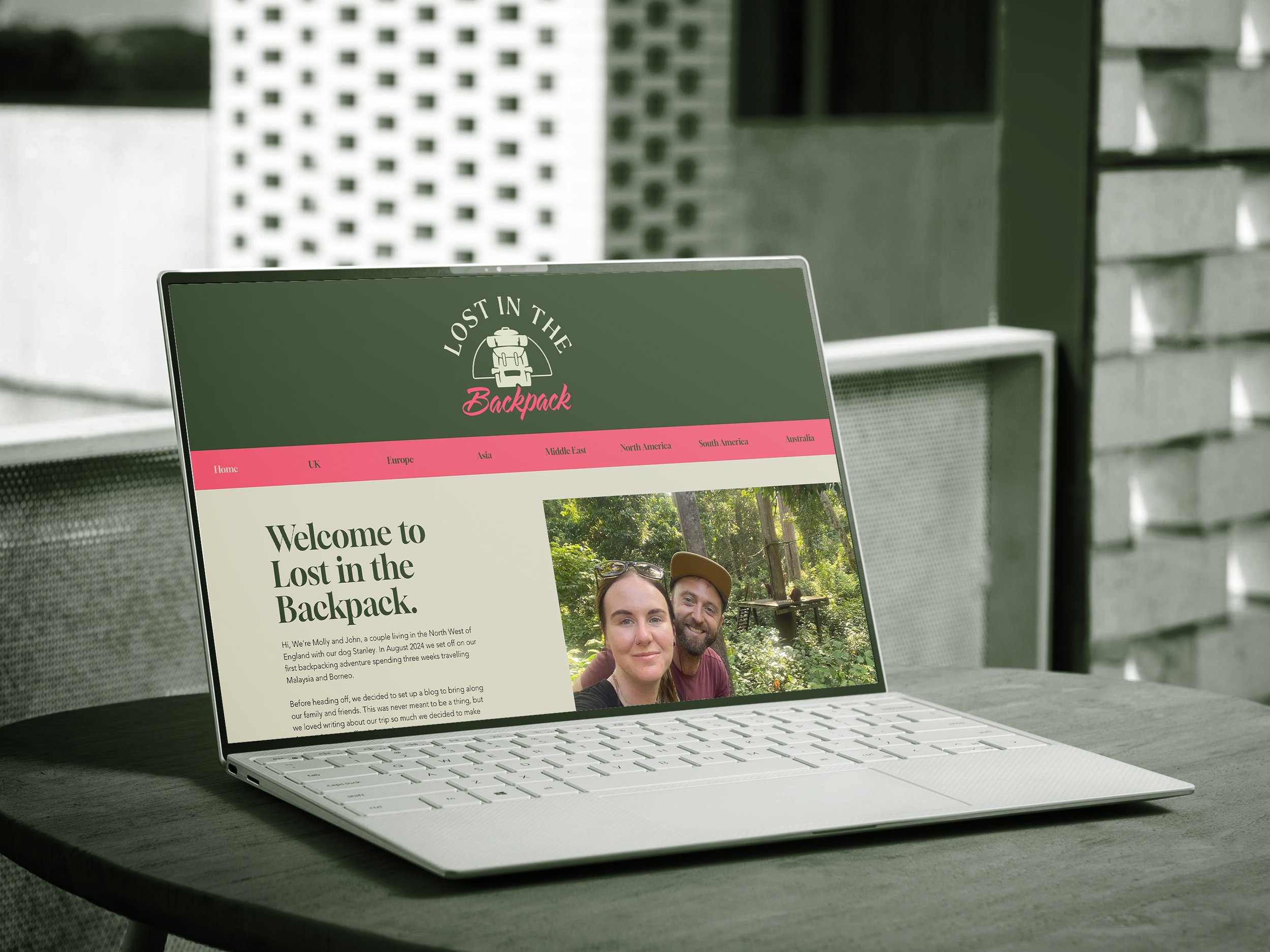
The illustration style was continued beyond the logo, creating custom assets for use on the blog website and social media. Again you can see the blend between traditional and modern, with the punch of pink really cutting through against the more muted cream and dark green.
