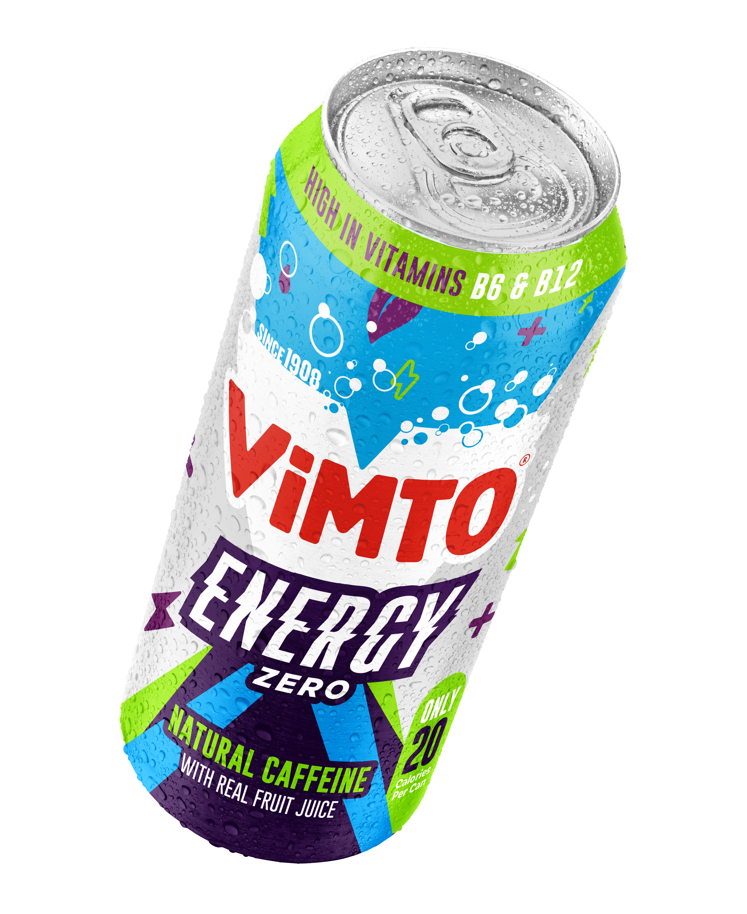
Vimto® Energy
The energy drink market was untapped territory for the Vimto brand, who were looking to enter with a bang!
Brief
Develop a brand identity for Vimto energy, original and zero sugar, with focus on the product's natural caffeine, vitamin content and unmistakable Vimto taste.
Solution
Vimto as a brand is all about doing things differently and having fun whilst doing it. Whilst it was a given that the branding for their new energy drinks should be recognisable as a Vimto product, the intention was to differentiate it somewhat from the core range. After all, this was no ordinary Vimto product!
After various concepts were produced and tests carried out, the design landed upon was extremely dynamic and impactful, giving an instant sense of movement and energy! This is absolutely true for the Energy lockup, which is bold and striking, so as not to allow the product to be confused with regular Vimto sparkling. The core Vimto purple colours were used in conjunction with a hit of bright green to denote the natural caffeine, with light blue and raw aluminium for zero cues. Iconography was included to suggest the effects and benefits of the products.
Initially launched in Poundland, with more listings being agreed all the time, the launch has been very successful and the products have been extremely well received.
Designed in partnership with the creative team at Vimto. ©Nichols PLC


